
AIRLINE WEBSITE
Discover an enjoyable
travel booking experience …
THE PROBLEM
Flight booking process tends to be a fairly involving task where users/people experience significant frustration and drop-off due to complex navigation, unclear information, and a lack of user-friendly features, resulting in low conversion rates, customer dissatisfaction all affecting brand perception .
The client is an airline start-up that was looking to create an online experience that is fast, easy and intuitive and is based on a deep
understanding of their target users.
How can I create flight booking experience that keeps users engaged and confident? How can I encourage trust and improve brand perception?
KEY GOAL
Create a fast and intuitive online experience based on deep understanding of the target users needs
KEY METHODS
UX Research and Analysis
UX Design
Brand Strategy and Design
MY ROLE
Branding and UX/UI Designer
RESPONSBILITIES
METHODS AND TOOLS
UX Research and Analysis
UX Design
Brand Strategy and Design
User Interview, Competitive Analysis, Usability testing, Affinity Diagram, Customer Journey Map, Flow diagram, Prototyping, Figma.
A wise man once said…
“Design is not just what it looks like and feels like. Design is how it works.” Steve Jobs
To make things work effectively, collaboration is essential! Collaborating with shareholders: Developers and Managers to meet user expectations and business goals.

UNDERSTANDING THE USER
Who?
What?
Putting users (people) first is the foundation of an improved airline booking experience
WHO ARE THE USERS?
Airline website users range from tech-savvy frequent flyers to first-time travelers with limited digital experience. Whether booking flights, checking schedules, or exploring services, both leisure and business travellers rely on an intuitive and efficient online experience to meet their needs.
WHAT ARE THEY TRYING TO DO?
The majority of users tried searching for flights based on destination, dates, and preferences / Comparing prices and flight options / Selecting seats and additional services.
Other users tried checking schedules and flight status /
Learning about services such as baggage policies.
How?
HOW?!
Book directly with airline websites and mobile apps
Used travel aggregator websites
Booking via customer service channels
Leveraging loyalty programs and memberships
Qualitative and Quantitive data collected to improve triangulation:
survey 50 participants / usability tests and interviews 6 participants
/ Competitive analysis 4 airlines (low/mid cost)

/ Understanding the user
" A user-centric approach in design drives customer satisfaction and loyalty, ultimately fuelling business success." – Don Norman
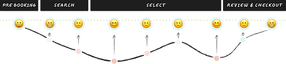
BREAKING DOWN THE PROCESS
Embarking on the user journey /
Mapping the steps people take to book their flights comprehensively and effectively.
Mapping out the booking journey
homepage > search > select > review & checkout
search flight > view options > select flight > enter passenger information
> review and confirm booking > payment > receive confirmation
Gathering insights from the research process, I mapped out every stage of the airline booking journey, as well as the user's pain points and frustrations
competitive analysis / usability tests and interviews / surveys

USER'S MAIN PAIN POINTS AND FRUSTRATIONS
> Mental overload and complexity - complicated navigations and too many options
> unclear information, lack of transparency and hidden costs
> Friction during booking process - long forms and technical issues
> improve customer support tools
All can reduce efficiency, confidence and affect trust and brand loyalty.
How can I turn negative emotions into positive ?
The mapping helped to identify areas that needed focus and improvements
Reshaping functionality, flows and navigations
Breaking down each step
Leveraging user research and established design best practices, I implemented a user-centred information architecture (IA) that prioritises discoverability, minimises cognitive load, and optimises task completion efficiency. This focus on user experience results in a smoother booking journey, ultimately driving higher conversion rates for the airline.
Streamlining Navigation:
The goal was to create clear and intuitive navigation that minimises user effort. This makes finding flights and completing tasks effortless, keeping users engaged throughout the booking process.
Boosting Efficiency
By simplifying the user journey, we enabled travellers to reach their travel goals quickly and easily. This translates to a smoother booking experience, ultimately bringing them one step closer to their dream vacation.
The "happy path" scenario effectively demonstrated the ideal booking flow and served as a foundation for the interaction design. While it didn't encompass all potential user journeys (edge cases), it provided a strong starting point for optimizing the core booking process.
customer journey map / flow diagram
PLANNING USER'S FLOW
Taking a step back to examine the user flow during the booking process.

Search > flights
Select - destination / dates / passengers
Select > seats / add on luggage / extras
step 2> flight seats
step 3> add on luggage
step 4> add on extras
Select > flights
step 1> flight fairs
Review and checkout
step 5> review / passengers details / login
payment and confirmation
Strategy and design
Design > test > iterate
My focus seamlessly transitioned between the broader design aspects—such as macro functionality, user flow, and navigation—and the intricate micro elements that enhance and support these features, ensuring a cohesive and effective user experience.
The user's first impression was crucial! To make the initial interaction inviting and easy to navigate, I implemented a minimalist, clean design with a clear visual hierarchy. This included a prominent search bar with clear labels and easy access to key features.
I tested and iterated the design and based on key finding, upgrading the prototype from low-fidelity to mid-fidelity, and ultimately to high-fidelity.
SEARCH BAR / SNAPSHOT / TESTING AND ITERATION
Prototyping from low-fidelity to mid-fidelity, and ultimately to high-fidelity.


Homepage> Search > flight > Dates
Navigating through the first steps
of flight search interaction
Allowing system flexibility and quick response > improving task speed and fluency > keeping the user engaged and positive

Select > flights
Navigating through flight selection
Allowing system flexibility and quick response > improving task speed and fluency

SEAT SELECTION/ TESTING AND ITERATION / KEY FINDINGS
The assumption that reducing screens, in Version 1, would speed up task completion was disproven in testing. However, dividing the task into three screens in Version 2 resulted in smoother interaction and improved efficiency, aligning user experience enhancements with business objectives for greater satisfaction.

Select > seats / Version 1 / BEFORE
Navigating through seats selection
This version passed the initial low fidelity prototype but when tested mid fidelity prototype it slowed the user - forced learnability and increased mental overload.


Select > seats / Version 2 / AFTER
Navigating through seats selection
This version improved fluency and improved the user's engagement and confidence.
-
Simplify Forms - breaking forms into manageable sections and requesting only essential information helps the user to complete the task quickly.
-
Auto-fill and predictive text helps to speed up form completion.
-
Improve error handling
-
Ensure consistency: Use consistent input field designs and formats throughout the form.
REVIEW & CHECKOUT/ FORMS & PAYMENT/ KEY FINDINGS

Review & checkout >
fill form > payment form
Navigating through forms
and payment
Improving the design and user experience aspects can lead to increased conversions and customer satisfaction.


DESIGN / FLIGHT BOOKING USE CASE

SOME KEY LEARNINGS…
Keep it simple!
Put yourself in the users' shoes
Streamlining the booking process with clear steps and minimal distractions enhances user satisfaction and reduces abandonment rates
Come fly with me…
Let's flow away… embracing
smooth user experience
Effortless flow and intuitive navigation pave the way for seamless user journeys
System Visibility enhances user confidence and reduces potential errors
Clear indicators for flight availability, booking progress, payment status, and confirmation messages help users understand the status of their actions clearly.
Prioritise and organise information… minimise cognitive overload
Clear filters, displaying essential information and fare breakdown can assist user during flight selection complex task
Intuitive architecture is essential for a complex booking process
Implementing a clear IA helps to improve discoverability and task completion

LESSONS LEARNED
Understanding diverse user Journeys
Not all users navigate the airline booking process in the same way. Different users have unique preferences, needs, and behaviours that impact their interaction with the website. Designing for this diversity requires understanding and accommodating various user journeys to ensure an inclusive and effective user experience.
Considerations
Can AI transform the way we book flights?
AI presents exciting opportunities to enhance the airline booking experience. However, a thoughtful and responsible approach that prioritises user privacy, fairness, and data security is crucial. Additionally, finding the right balance between AI automation and human interaction will be key to creating a truly user-friendly booking journey for all travellers.